
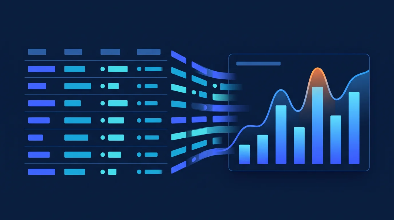
There are hundreds of thousands of records in the database, but this data is buried in spreadsheets, making sense of it takes hours, and processing the data from scratch is required for every report. When the right data is needed to make the right decisions, the system either cannot respond or the response comes too late. Which product is actually making money, which region is seeing declining sales, which customer segment is eroding — the answers to these questions are hidden within the data.
Our Solution Approach
At Barlas Dijital, we are concerned not just with storing data, but with bringing it into a comprehensible and actionable form. We process large datasets with Python and Pandas, and produce interactive charts with Chart.js, Recharts, and Plotly. Automated reporting systems ensure that patterns and anomalies within the data reach managers automatically on a weekly or monthly basis.
Scope & Features
- Interactive dashboard charts — Filterable, zoom-enabled, drill-down dynamic data presentation
- Time series analysis — Trend, seasonality, and anomaly detection; alerts on sudden changes in sales or traffic
- Geographic maps — Sales, distribution, and density visualization at city, region, or district level
- Comparative analyses — Period, product, channel, or customer segment comparison charts
- Automated PDF report generation — Report generation at defined intervals and distribution via email
- Cohort and funnel analyses — Visualizations revealing behavioral patterns of customer segments
- Large dataset processing — Fast analysis and summarization of millions of rows of data with Python Pandas
- Data source integration — PostgreSQL, MSSQL, BigQuery, Google Sheets, and REST API connections
Technical Standards
Chart.js and Recharts are integrated into web applications for the visualization layer, while Plotly and D3.js are used for scientific or complex analyses. Data processing pipelines are written in Python (Pandas, NumPy); for large datasets, query optimization and a caching layer are added to keep visualization response times below 1 second. In the G-Risk project, decision-support screens also made data analysis visible.
Who Is It For?
- Mid-sized businesses that want to track sales, marketing, or operations data in real time
- Companies that want to free management reporting from a weekly, repetitive manual process
- Businesses with multi-channel or multi-location structures that need consolidated visibility
Expected Outcomes
- Time to prepare weekly management reports drops from several hours to zero; reports arrive automatically
- Sales drops, stock anomalies, or performance deviations are noticed in real time
- All stakeholders are fed from the same data; “which number is correct?” debates come to an end
- Decision-making processes accelerate; a data-driven culture takes root within the team
Frequently Asked Questions
Our data sits in different systems; which sources can you connect to?
Connections to PostgreSQL, MSSQL, BigQuery, Google Sheets and REST APIs can be set up. Because the data processing layer is written in Python (Pandas, NumPy), data coming from different sources can be brought together into a single view.
Will we still have to prepare the reports by hand?
No. PDF reports are generated automatically at defined intervals and distributed by email. Patterns and anomalies within the data reach managers on their own, weekly or monthly.
Will the dashboard slow down with millions of rows of data?
Large datasets are processed with Python Pandas; on top of that, query optimization is applied and a caching layer is added. The target is to keep visualization response times below 1 second.
What kinds of charts and analyses can be produced?
Interactive dashboard charts with filtering, zoom and drill-down; time series analyses covering trend, seasonality and anomaly detection; and geographic maps at city, region or district level. Period, product, channel or customer segment comparisons, along with cohort and funnel analyses, are also in scope. Chart.js and Recharts are integrated into web applications, while Plotly and D3.js are used for scientific or complex analyses.
Clarify This Need
Share the current process, the system you use and the outcome you expect. We will turn it into a practical first scope.
Discuss the SolutionWhatsApp UsProjects Where We Used This Service
REST API-based dynamic QR code management platform with PHP Slim 4. PHPMailer integration, form management and tracking system.
Multi-Channel E-Commerce and ERP IntegrationA digital ecosystem that connects e-commerce, marketplace, ERP, inventory, product feed and iOS/Android mobile app flows through one data layer.
G-Risk: Financial Strategy Backtesting EngineA backtesting engine and web dashboard built with Python + Backtrader that tests financial strategies against historical data.
MSSQL XML Agent: ERP Automation AgentPortable Windows automation agent that exports XML from MSSQL databases for ERP flows, with scheduling and a web management UI.